I have been wanting to dabble with IoT (Internet of Things) for a little while now. My interest, aside from the geek aspect, is uncovering some insight from analyzing signals over time. To get there, I am starting with the data collection and analysis side – stitching together Microsoft Azure Event Hubs, Stream Analytics, and Power BI.
Since wiring up an IoT device is part two, I looked for real-time signals available on the Internet that might be interesting to analyze. Some ideas that came to mind:
- Improved usage data for the the products I work on: While we are already using Power BI, understanding the toolchain myself could help us get better answers to a number of questions. By segment, which features are used the most? Which ones are experiencing the most growth?
- Logfiles for websites I operate: Are there any request patterns that might indicate a DoS attack? Do users from different channels show different usage patterns?
- Sentiment on Twitter for a stock: How does that relate to movements in the actual stock price?
- My personal Twitter feed: How many Tweets do I receive each day? Which time of day and day of the week do I receive the most Tweets? Who is the most active? Which user’s Tweets have the highest sentiment score?
For this exercise, I’ve gone with the last option – my personal Twitter feed. That said, armed with this toolchain, I look to improve the Power BI dashboards we already have available for the products I work on.
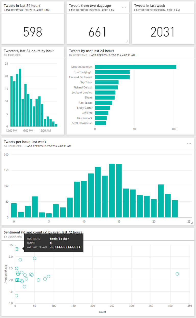
Here are some insights that have emerged from the dashboard. All times are Pacific:
- I get 600-700 Tweets per weekday in my feed.
- There are ~75 distinct users whose Tweets I see in my feed every day. Over a week, it’s ~125 users.
- By far, Mark Andreeseen is the top user in my feed, generating 103 Tweets in the last 24 hours and 166 Tweets in the 24 hours before that.
- Of the top 12 users the last two days, only three are folks I personally know. All three are co-workers.
- I get the most Tweets each day between noon and 3pm.
- In the last three days, five of the “active” users (at least two Tweets) have an average hourly sentiment score of at least 2.5 (on a scale of 0-4, where 4 is the most positive). That includes three “celebrity” accounts – RocketSpace, Boris Becker, Abel James – and two folks I know personally – Brady Gaster, Rick Rainey. It’s perhaps not surprising to see Becker in this list with Novak Djokovic [the #1 tennis player in the world, coached by Becker] playing phenomenally at the moment:)
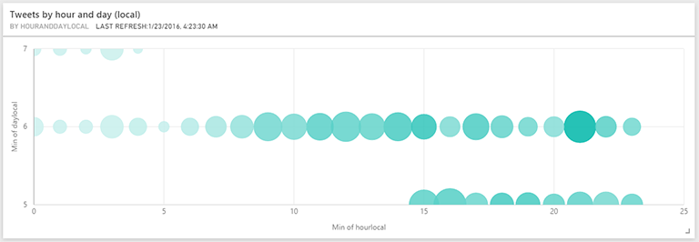
- While I don’t yet have a full week of data, the most popular hour x day combinations so far are Friday 9pm and Thursday 4pm with 54 and 56 Tweets, respectively.
In the remainder of this post:
- Overall approach
- Pump the data into Azure Event Hubs
- Process real-time streams with Azure Stream Analytics
- Visualize the data with Power BI
- Next
Overall approach
Rewinding now, here is the approach I took to build the dashboard after doing a bit of research:

- Articulate which questions need to be answered, and extract the necessary dimensions and measures: In the Twitter example, some key dimensions or independent/categorical variables are Hour, Day, DayOfWeek, Month and UserName. The key measures I care about along these dimensions are CountOfTweets, CountOfDistinctUsers and AvgSentimentScore.
- Optimize for real-time, or optimize for analytics: In its current form at least, Power BI gives a bit more flexibility as it relates to joins if you put the data in an intermediate store (e.g. Excel) first. But, since the ultimate goal is IoT analytics, I optimized for realtime and ensured the data stream I feed into Power BI is “denormalized” and contains all the dimensions I ultimately want to report on.
- Write an app that uses the Twitter streaming API to pump the data into Azure Event Hubs: While perhaps overkill for my Twitter scenario, Event Hubs is ideal for the ultimate scenario – receiving telemetry from potentially millions of devices. I used an Azure App Service WebJob to host a console application that receives Tweets using the Twitter streaming API and sends them to Event Hubs.
- Process the real-time stream with Azure Stream Analytics: Again while perhaps overkill for my Twitter scenario, Stream Analytics is ideal for taking a large stream of real-time data and grouping it by time.
- Visualize it with Power BI: Microsoft Power BI is a great online data visualization tool. You can optionally use Power BI Desktop to author and publish reports, or you can do all the authoring online. For real-time scenarios, the latter appears to be the supported approach since Stream Analytics directly sends the data to a PowerBI.com dataset.
Further details on some of the steps are below:
Pump the data into Azure Event Hubs
After deciding I wanted to take Twitter streaming data and pump it into Azure Event Hubs, I was fortunate to stumble upon a sample from the Stream Analytics team that was a great starting point. It is a .NET console app that reads from the Twitter stream API, uses http://www.sentiment140.com to determine sentiment and then sends the resulting data to Event Hubs. The accompanying article walks through a number of these steps, so I won’t repeat all that below. I’ll focus on the Power BI side (which is not covered), as well as any deltas from the article:
To get started, I forked the sample project and made the following changes:
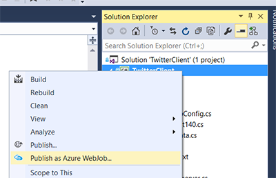
- Rather than run it locally, I host it on Azure App Service as a WebJob. This is very easy to do from Visual Studio with the Publish as Azure WebJob gesture available on Console projects.
- I added more tracing, since this is a long running process and there are multiple possible failure points – invoking the Twitter Stream, Azure Event Hubs and Sentiment140 APIs.
- Read my user stream (https://userstream.twitter.com/1.1/user.json) instead of the global stream.
- Send UserName and UtcOffset to Event Hubs, instead of Topic. This is to see measures (e.g. counts) by user and local time dimensions instead of the topic and UTC time dimensions in the sample.
Process real-time streams with Azure Stream Analytics
After pushing the data to Event Hubs, the next step is to have this data flow into Stream Analytics. Ingesting data from Event Hubs into Stream Analytics is covered in the previously mentioned article. So, I will not rehash those details. However, I did change the query – which transforms the input from Event Hubs into an output for Power BI – to meet the following goals:
- Aggregate the raw data by time window, to manage the amount of data that has to flow into Power BI. The GROUP BY TUMBLINGWINDOW(hh, 1), UserName clause below accomplishes that, while also grouping by UserName to preserve the ability report on users over different time dimensions.
- Transform the data into a form that contains the dimensions and measures to report on in Power BI.
Ultimately, I ended up with the following query which does meet the goals. That said, I am not thrilled with having to duplicate DATEADD(hh, CAST(MAX(UtcOffset) as bigint), System.Timestamp) to have the various time dimensions show as local time. But, I could not find a way to alias this fragment that would preserve query behavior. Let me know in the comments if there is a more succinct way to write the below query:
SELECT
System.Timestamp as Time,
UserName,
MAX(UtcOffset) as UtcOffset,
DATEADD(hh, CAST(MAX(UtcOffset) as bigint), System.Timestamp) TimeLocal,
CASE DATEPART(weekday, DATEADD(hh, CAST(MAX(UtcOffset) as bigint), System.Timestamp))
WHEN 1 THEN 'Sunday'
WHEN 2 THEN 'Monday'
WHEN 3 THEN 'Tuesday'
WHEN 4 THEN 'Wednesday'
WHEN 5 THEN 'Thursday'
WHEN 6 THEN 'Friday'
ELSE 'Saturday'
END AS DayStrLocal,
CASE MONTH(DATEADD(hh, CAST(MAX(UtcOffset) as bigint), System.Timestamp))
WHEN 1 THEN 'January'
WHEN 2 THEN 'February'
WHEN 3 THEN 'March'
WHEN 4 THEN 'April'
WHEN 5 THEN 'May'
WHEN 6 THEN 'June'
WHEN 7 THEN 'July'
WHEN 8 THEN 'August'
WHEN 9 THEN 'September'
WHEN 10 THEN 'October'
WHEN 11 THEN 'November'
ELSE 'December'
END AS MonthStrLocal,
DATEPART(hour, DATEADD(hh, CAST(MAX(UtcOffset) as bigint), System.Timestamp)) as HourLocal,
DATEPART(weekday, DATEADD(hh, CAST(MAX(UtcOffset) as bigint), System.Timestamp)) as DayLocal,
(DATEPART(hour, DATEADD(hh, CAST(MAX(UtcOffset) as bigint), System.Timestamp)) * 10 + DATEPART(weekday, DATEADD(hh, CAST(MAX(UtcOffset) as bigint), System.Timestamp))) as HourAndDayLocal,
MONTH(DATEADD(hh, CAST(MAX(UtcOffset) as bigint), System.Timestamp)) as MonthLocal,
YEAR(DATEADD(hh, CAST(MAX(UtcOffset) as bigint), System.Timestamp)) as YearLocal,
COUNT(*),
AVG(SentimentScore),
MIN(SentimentScore),
Max(SentimentScore),
STDEV(SentimentScore)
INTO tweetshourly
FROM TwitterStream TIMESTAMP BY CreatedAt
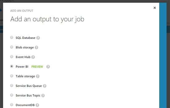
GROUP BY TUMBLINGWINDOW(hh, 1), UserNameOn the output side, I also deviated from the sample by directly pushing to Power BI.
As mentioned earlier, this is ideal for real-time but does introduce some limitations for analysis. Specifically, you cannot join other datasets. The workaround is to ensure the dataset is de-normalized. The above query from Stream Analytics does just that, creating a number of time dimensions, for example.
Visualize the data with Power BI
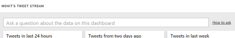
The last part is building the Power BI dashboard off of the dataset that gets populated by Stream Analytics. For real-time data, there are two options. The first is to generate a report and then pin the various widgets to a dashboard. The limitation here is that you cannot limit the widgets to a time offset from now. In other words, “last 24 hours”, “last week”, etc. are not possible. The second option, and the one I primarily used, is to use the very cool Q&A feature:
Here are the exact questions I typed to build each of the widgets on the dashboard:
- # of Tweets last day: show count where time is last 24 hours
- # of Tweets two days ago: show count where time is last 48 hours and not last 24 hours
- # of Tweets past week: show count where time is last 168 hours
- # of users last day: count distinct username last 24 hours
- # of users last week: count distinct username last 168 hours
- Users per hour last 24 hours (column chart): show count of username group by timelocal last 24 hours as column chart
- Tweets by user last day (bar chart): show count where time is last 24 hours group by username sorted by count
- Tweets by user two days ago (bar chart): show count where time is last 48 hours and not last 24 hours group by username sorted by count
- Tweets per hour, last week (bar chart): show sum of count group by hourlocal where time is last 168 hours as column
- Tweets per day, last week (bar chart): show count last 168 hours group by daystrlocal as column
- Sentiment and count by user, last 72 hours (scatter chart – my favorite!): show total count and average of avg group by username last 168 hours where count > 2
- Tweets per hour and day, last three days (bar chart): show count of tweets group by timelocal last 72 hours as column
In addition, I created a bubble chart to show the most popular hour x day combinations. A bubble chart is a scatter chart with the bubble size representing an additional dimension:
For this, I used the chart builder:
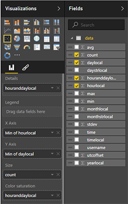
Note the use of the HoursAndDayLocal field, which I generated earlier in Stream Analytics with Hours x 10 + Day. This ensures a unique value for each hour and day combination, each of which ends up being a bubble and the dimension on which we add up the counts. Also note, that the columns and rows are aggregate values. This effectively makes them categorical. I could have chosen one of many functions – Min, Max, Avg – and they would have all had the same effect in this case. With an hour window, all rows share the same HourLocal and DayLocal since the incoming data is aggregated by hour.
Next
Unfortunately, I cannot share the finished dashboard since right now sharing is limited to users in the same organization only. But, I captured a good chunk of it (including the bubble chart) in the image at the top of the article.
Hope this post was helpful! I hope to soon get use the same backend for getting insights from an IoT device (e.g. a WI-FI connected scale, a heat/humidity sensor, etc.).